PLATFORM TRUST
Reassure people about the product.
Social proof, regulatory reassurance and transparent fees answer a question detractors weren’t asking.
LunarReported after the redesign
Research shifted the strategy from more education to fewer, more meaningful decisions. Themes became the discovery layer.
Context
Lunar had genuine trust in banking. People used the core product daily and recommended it to friends. The investment offering still stalled, and every obvious fix on the table assumed the problem was the product. I wasn’t sure it was.
I structured the research around the two extremes: detractors who had abandoned the flow, and ambassadors who wanted to move faster. They rarely contradicted each other. The gap between them became the agenda.
Signals that prompted a closer look
completion at baseline
hesitation before the first investment
Insight
If the problem is platform trust, you add social proof, regulatory reassurance, transparent fees. If the problem is self-trust, you remove decisions.
Detractors never once said the platform felt risky. They said investing wasn’t for someone like them. The barrier was identity, not knowledge.
PLATFORM TRUST
Social proof, regulatory reassurance and transparent fees answer a question detractors weren’t asking.
SELF-TRUST
The barrier was identity, not knowledge. Fewer, more meaningful decisions lower it.
DETRACTOR INTERVIEWS
A recurring line across every detractor interview.
Decisions
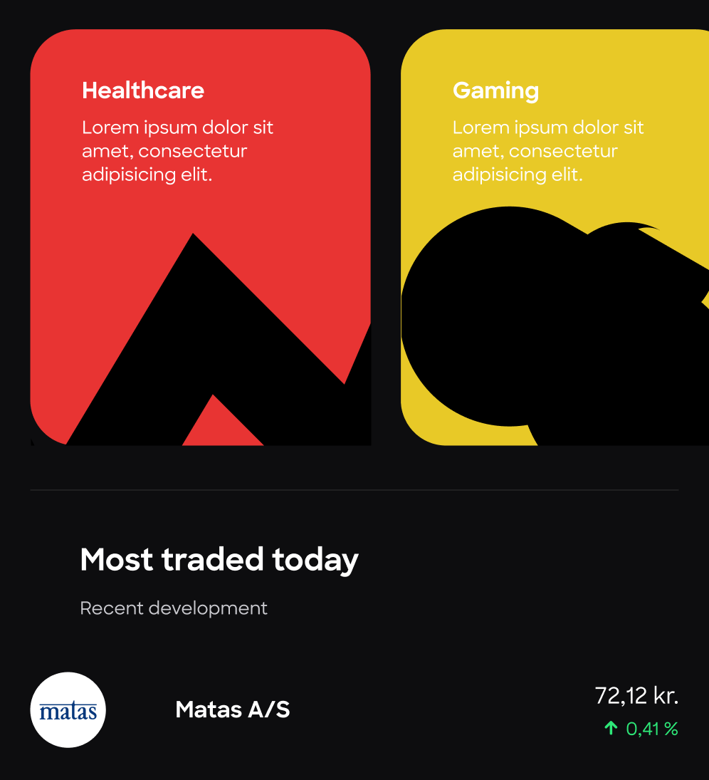
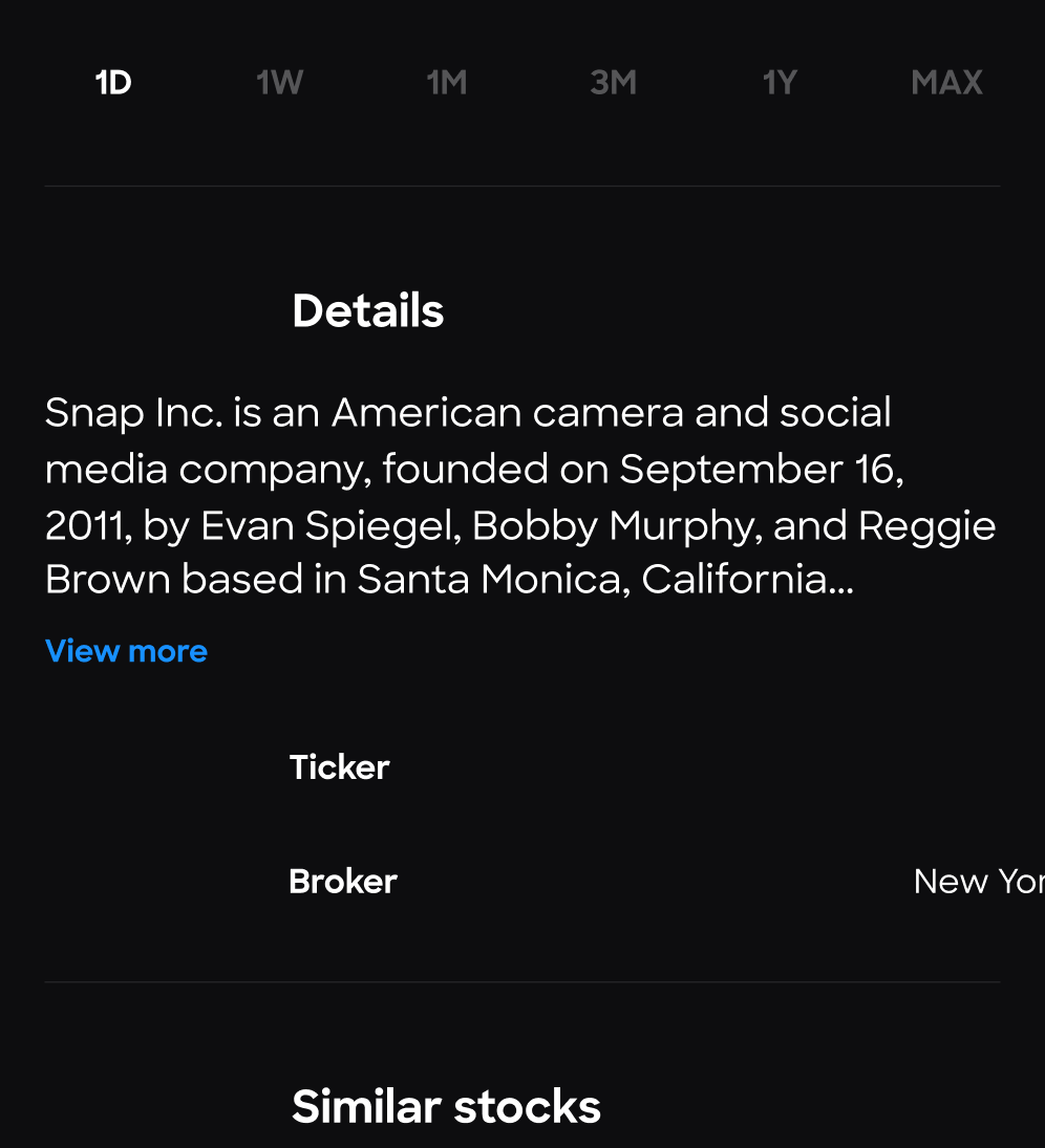
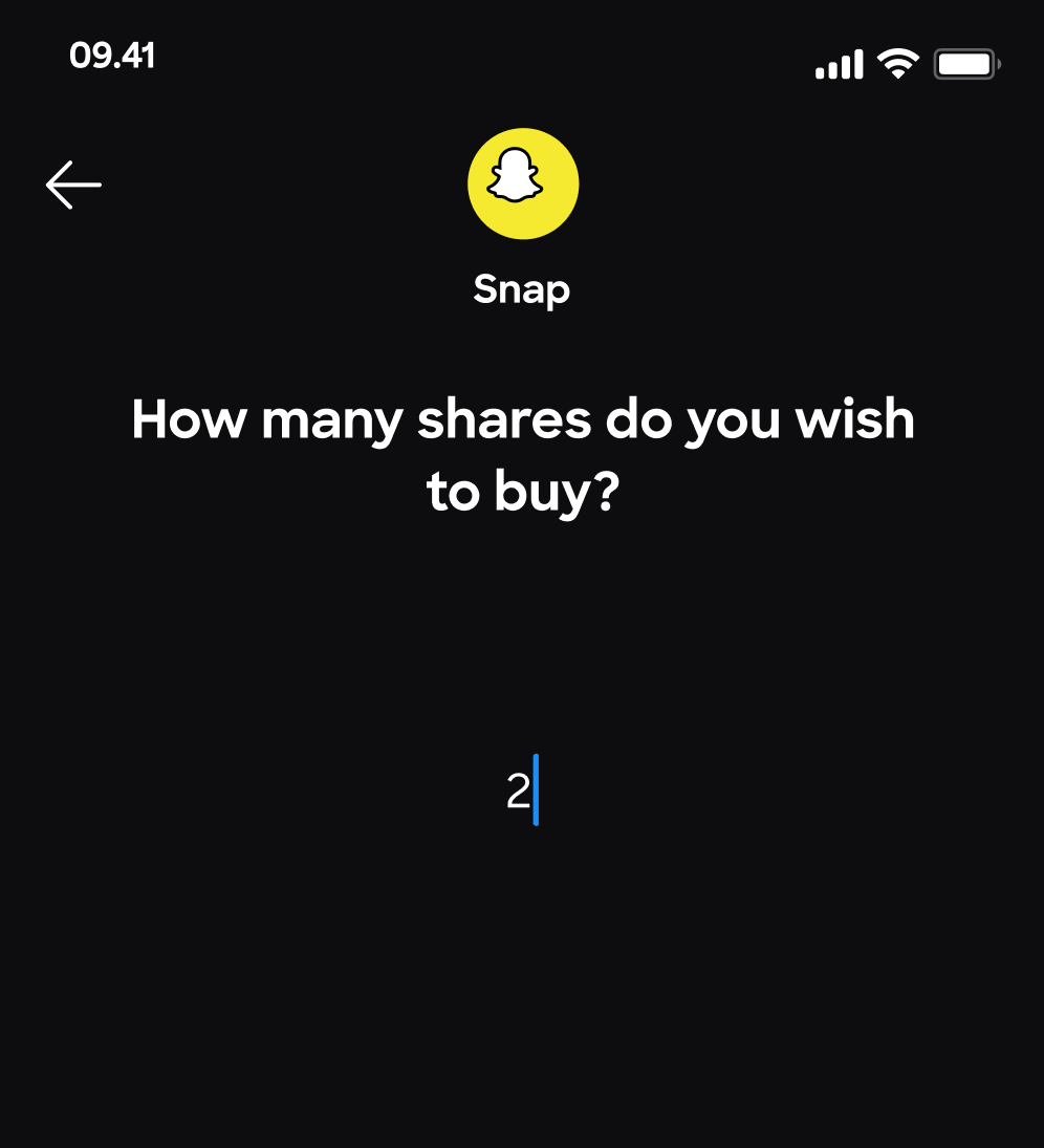
Themes became the discovery layer. Investing in Tech Giants is a statement of belief, not a judgment about asset allocation. The investment is the same. The person’s relationship to it is completely different. And the purchase flow asks exactly one question: how many shares.
I cut the education layer, which was the direction everyone expected. Detractors didn’t need to learn more. They needed a reason to see themselves as investors. Education solves a knowledge gap; themes solve an identity gap. The research only found the second one.
Impact
A 23-point completion improvement in a financial product is an information architecture win, not a visual one. Eight days of hesitation collapsed to 36 hours because the motivation now lived in the product.
Themed portfolios created a reason to return that asset-class browsing never did. Not better returns. A better relationship to the decision.
onboarding completion
time to first investment
return frequency, themed
What changed, and where
Moving the motivation into the product changed how quickly people started investing, and how often they came back.
Onboarding
Completion after the redesign
First investment
Time to first investment
Return
Return frequency, themed
Not better returns. A better relationship to the decision.